This section will explain my process for producing the backgrounds for my visual novel game FMP.
For my E1 submission I had developed these rough ideas of the hospital room background that would be the main setting of my game – I knew I wanted to stay with this kind of feel so I re-designed these for the final assets.
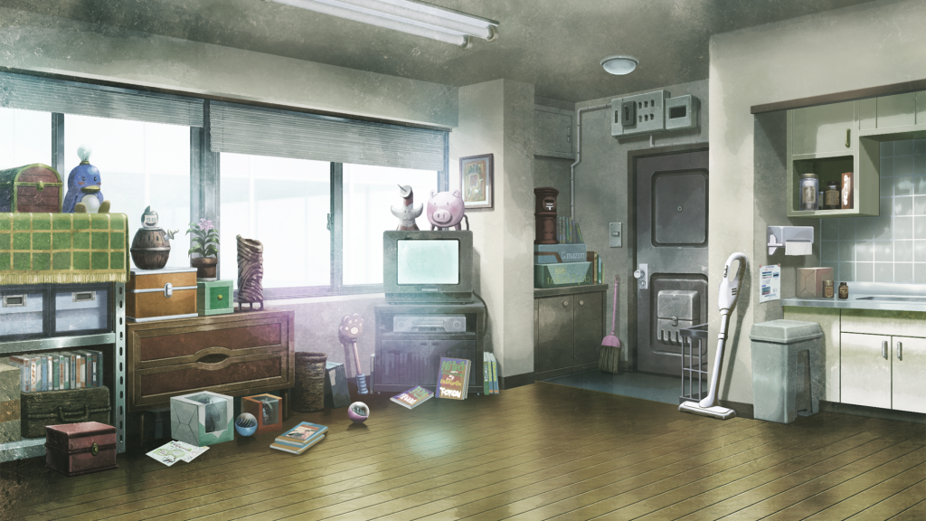
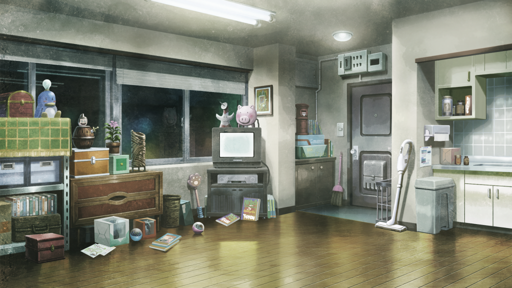
I also thought of having a background of the main characters house, however when I developed the story further I realised that I would only need 1 main background, with multiple versions – daytime, nighttime and a hallucination version – similarly to the sprites. This is because my VN takes place within one day, over one shift where the characters are working at a hospital.
As the game takes place in one day, the background changes to reflect the time and the of Lilith’s mental state – through environmental storytelling. I developed the central background first, wanting it to look bright and tranquil to reflect the peaceful start of the game. And it slowly devolves – to being darker and more eerie at nighttime, and then horrific as Lilith’s hallucinations set in.
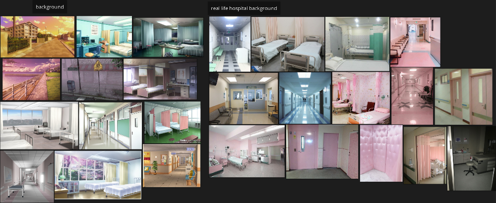
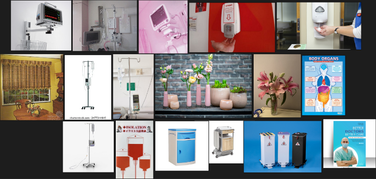
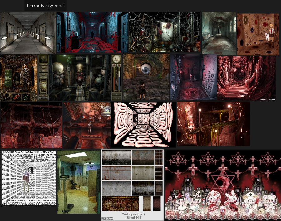
I went back to my moodboard for the background design, and added some more inspirations from pinterest. Looking at both real life hospital images and illustrations from other games/ VNs – to also get inspiration for the art style.
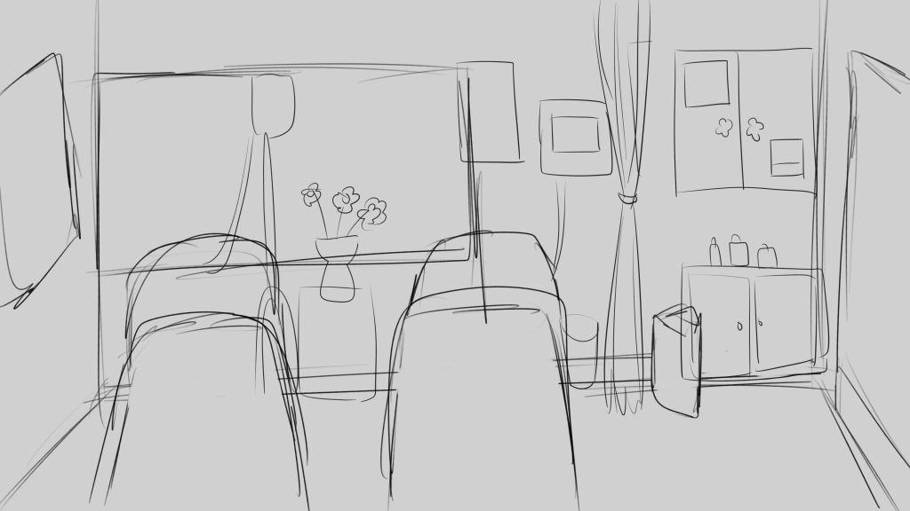
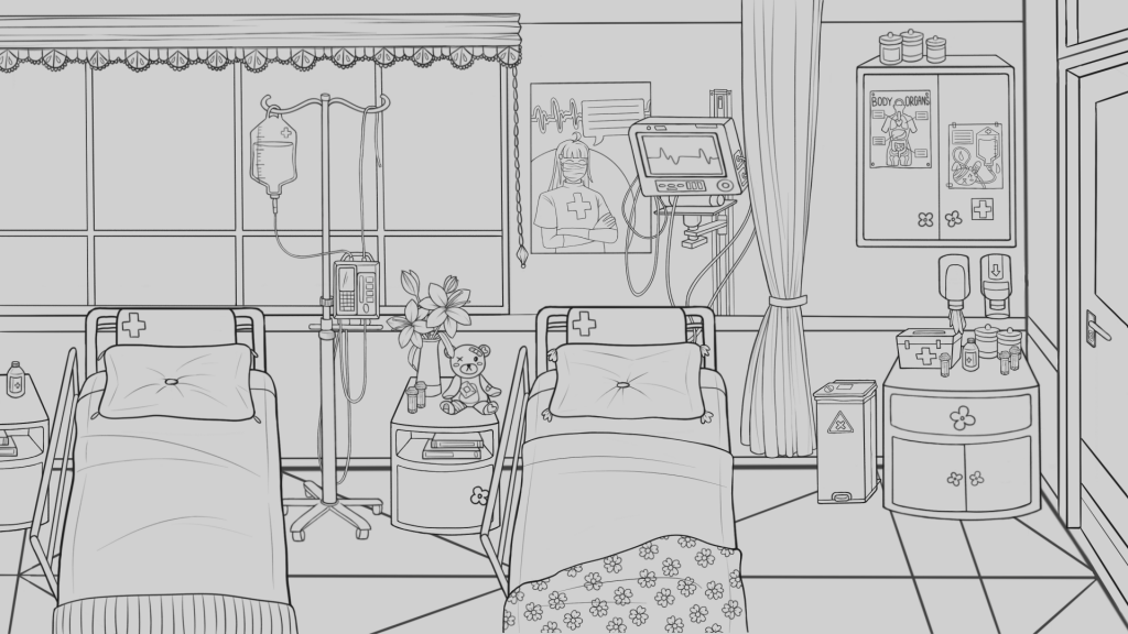
Firstly, I drew this rough sketch (working in Procreate) of what I wanted to include in the background, planning to include general objects that would be in a hospital room like beds, an IV, cupboards etc. I knew I wanted to include a large window as this would have relevance for the hallucination version, as something frightening would be shown out of the window there.
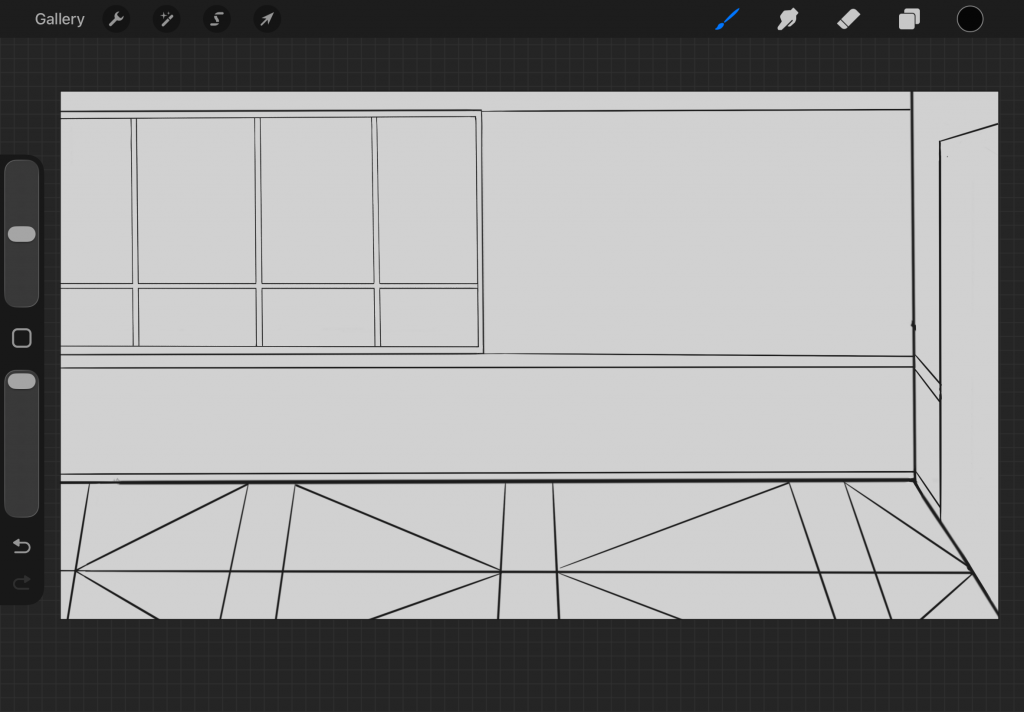
Then I made a solid plan of the structure of the background – the window, floor design and door placement.
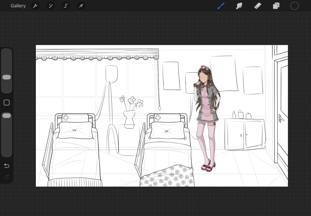
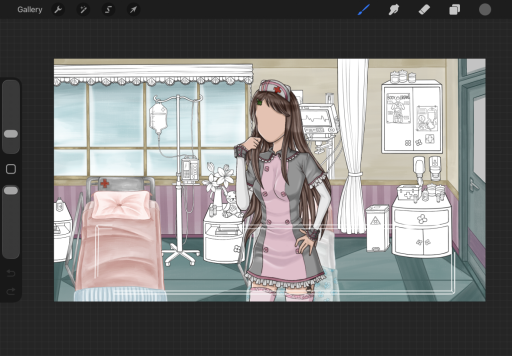
My tutor had seen my other background design and as I struggle with persepctive since I do not often draw bacckgrounds, he suggested that I place my character in the scene and draw around that as it would help me with the accuracy. So as I continued to draw the objects in the scene I used my character as a reference for the height of things.
As I started to draw the more detailed aspects of the hospital room – like the IV, heart monitor, soap dispensers, etc, I used specific reference images to get these as accurate as possible. I also used some references images for the poster designs. And I collated these images into my moodboard.
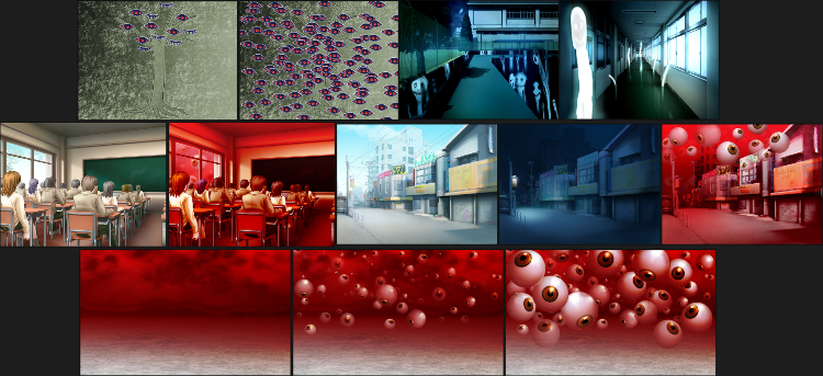
Before I started the colouring and rendering of the background I was looking for more inspirations for art style – especially since I am new to background drawings, I wanted to find a particular style to aim for. I was looking at assets from the steins;gate visual novel on the spriters resource again (https://www.spriters-resource.com/pc_computer/steinsgatesteamhdedition/). And I really liked the style of these backgrounds from the game. The paint texture, light and lack of distinct line art in them were nice and cinematic, so I decided I wanted to go for something in a similar style. I also thought that it would contrast the characters if there was a distinct texture and no black line art – making the characters stand out more.
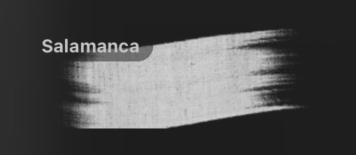
I tried out some brushes with a painterly texture in procreate and decided to use this salamanca brush. I was also glad to be trying out new textured looks in my art as usually I do not really explore in this way – and I am just now realising it can look quite flat!
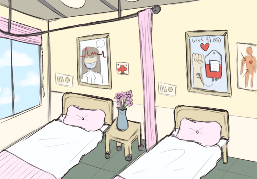
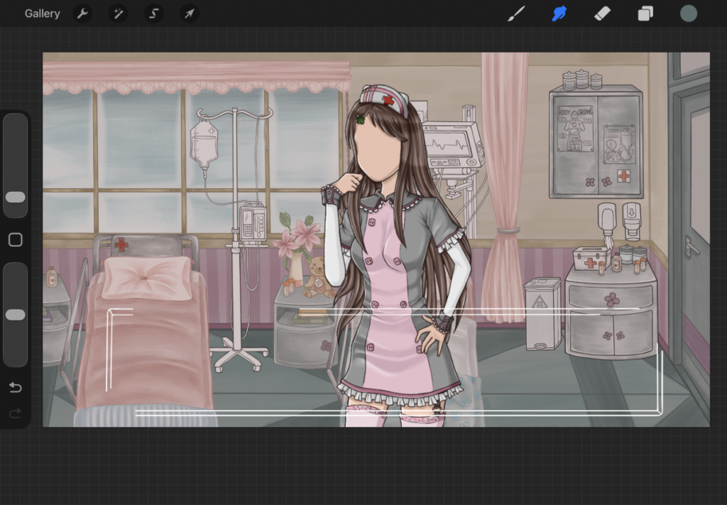
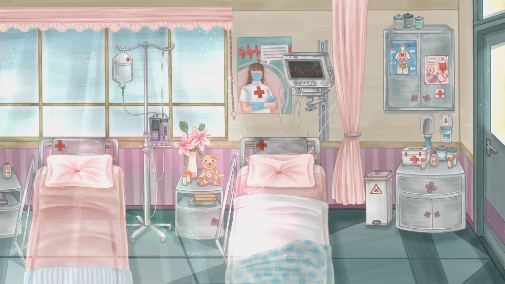
I started with colouring the walls, floor, door first – deciding on quite neutral/ peaceful colours to reflect the relaxed nature of the scene – contrasting with how it will look later on in the game. Then I started to change the colour of the line art from black, to match the colour I was using for the areas of the scene – to remove any black line art like my reference images. I then blocked out all of the objects away from the background of the scene in white, to make it easier to render them later.
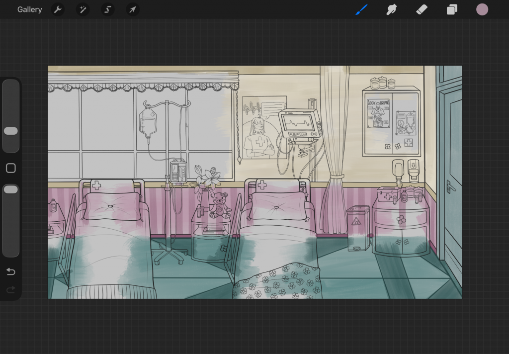
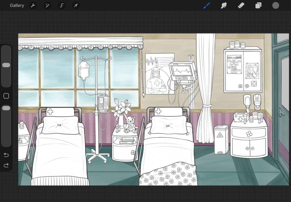
As I coloured the scene, I also checked how the characters and potential text box would look over it, and experimented with an overlay to make it a little darker, so that the character would stand out more. I did add an overlay to the finished work but much more subtle than what is shown here.
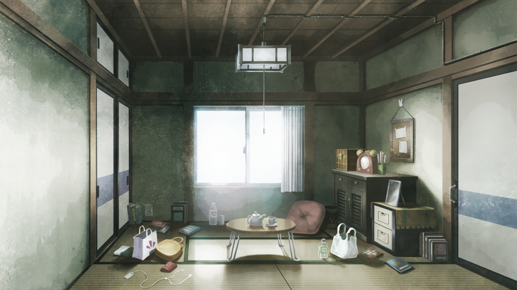
I kept the colours quite neutral as to not clash with the characters, but also adding some pops of red for cohesion with the characters and medical theme. When I had completely finished the colour rendering of the background, I reffered back to the steins;gate images and started adding light to the scene, to make it more cinematic and visually interesting. I added a coloured lens flare effect, light rays/ reflection from the windows and door, and some sparkle effects.
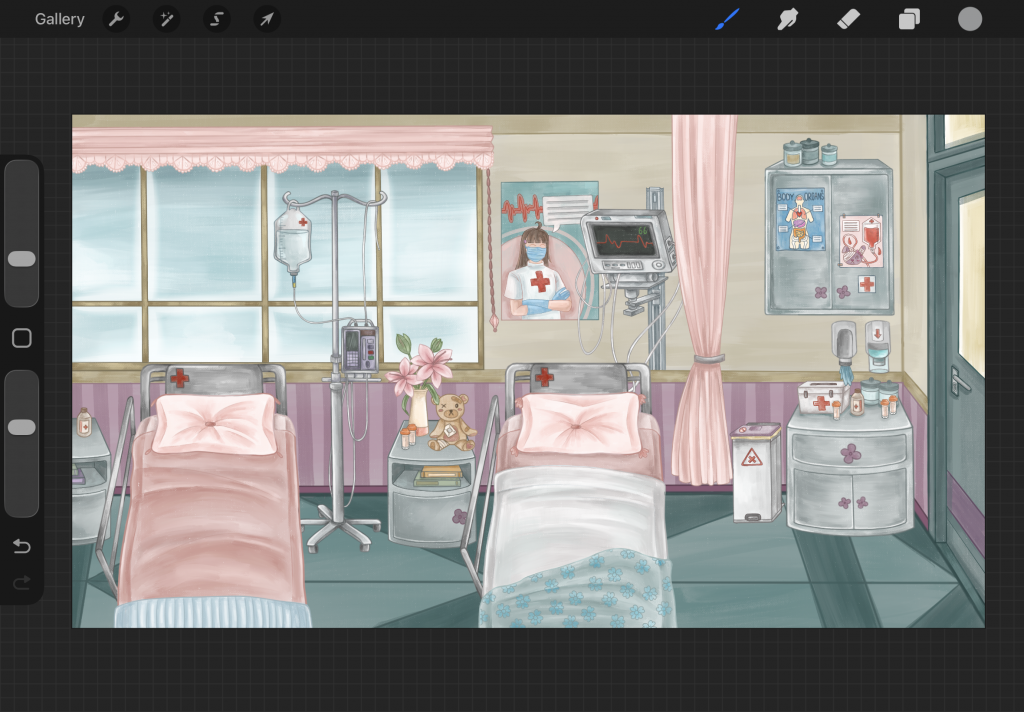
Below is the final hospital room daytime background:
This background ended up taking me much longer than I thought it would – due to the detail in it and the fact that I am not well versed in drawing backgrounds in general. I was thinking initially that I may have one more background other than these iterations of the hospital room, however I just was not able to create this with my remaining time unfortunately.
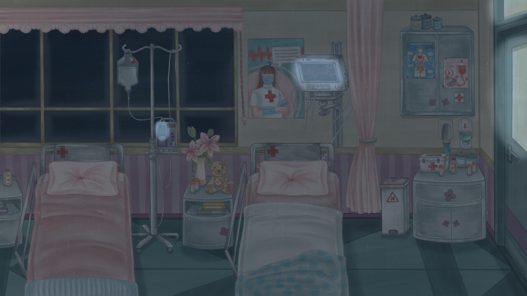
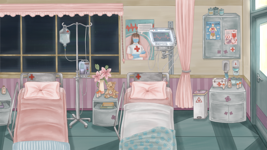
After this version was finished, I moved onto the nighttime version of the background. Which only features slight changes. Such as the dark blue overlay over the whole scene to give the impression of the lights being off. And the bright glowing from the screens of the heart monitor/ IV machines and coming through the door and the darkness outside of the window, which I achieved through the add blending mode on procreate that gives a glowing effect. I also made a version of this but with the lights on.
Horror version:
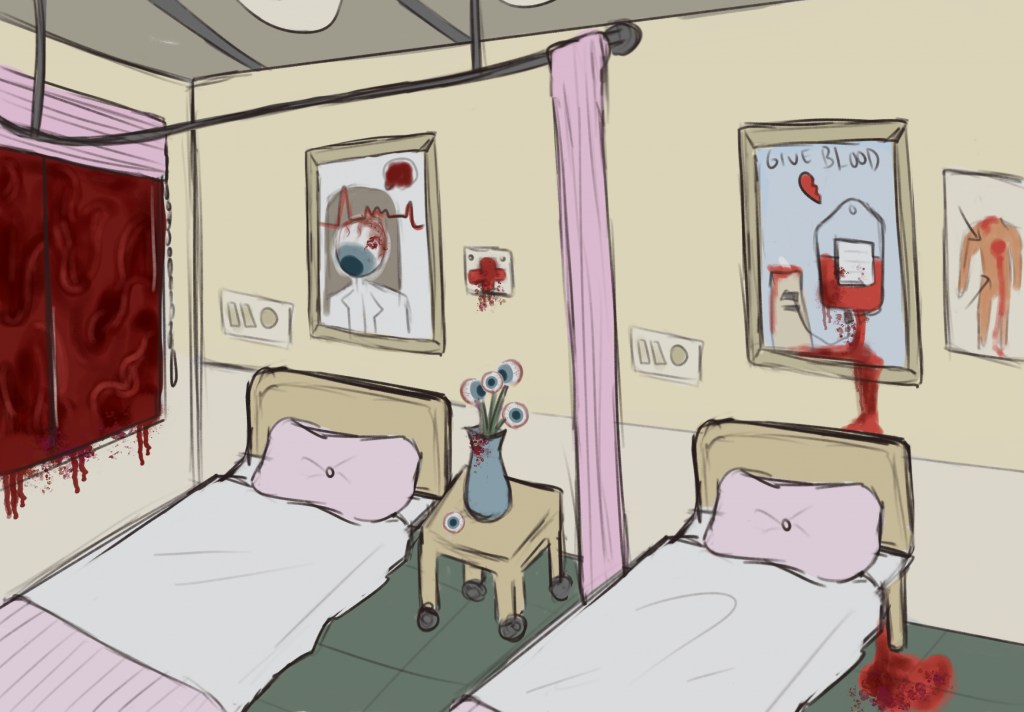
Lastly for the backgrounds, I created the horror/ hallucination version of the hospital room. The version that Lilith sees when she is not in her right mind and is overcome with paranoia.
Another reason why I wanted to make a background with multiple versions is the environmental storytelling that it provides – this is a common feature in horror visual novels, as it is an effective way to shock/ jumpscare the player. The change of a familiar and friendly scene to the same scene yet it is completely removed from the familiarity it once held.
During my E1 production, I had a friend play my short visual novel prototype at the time, and when the scene quickly changed backgrounds from the normal to horror version, she actually jumped a bit and was not expecting it, which was very satisfying to see haha! So I hoped for this final version to be even more effective at shocking the audience – and putting them in Liliths position, viewing this world through her eyes.
Again I added some more images to my horror background moodboard, and looked specifically at some horror visual novel backgrounds that also use this technique of backgrounds with multiple versions. I looked at backgrounds from gore screaming show and subarashiki hibi.
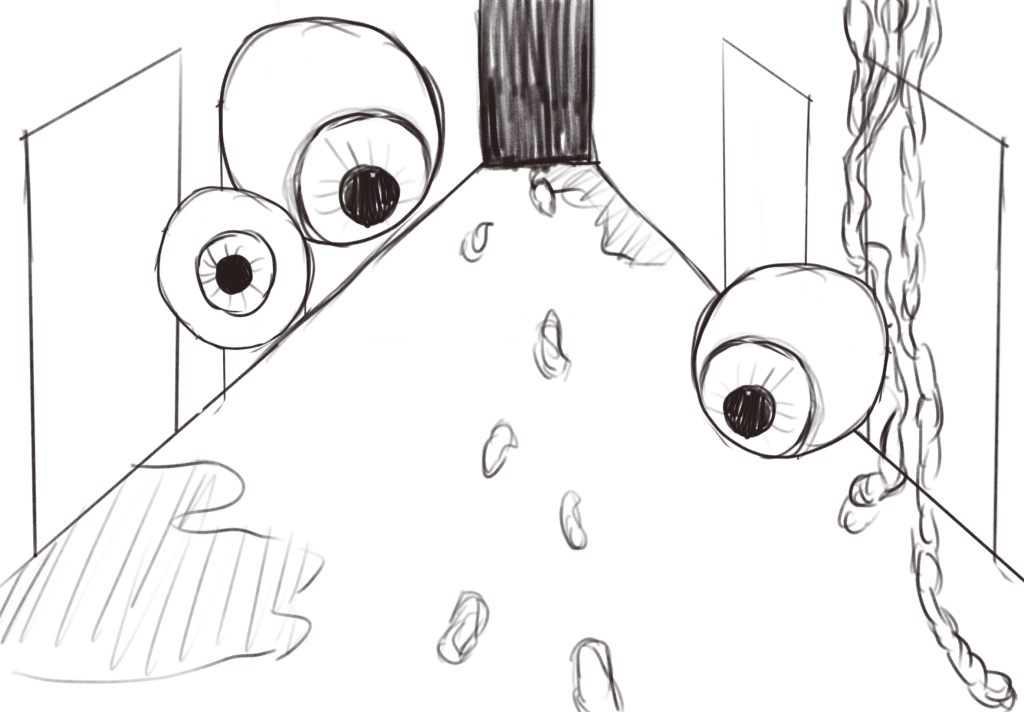
I created this rough sketch of an idea for a horror background and applied it to my final idea. With eyes and blood/ gore placed around the scene. I wanted to include eyes as they are already a creepy feature on their own, but for my story they symbolise Liliths feeling of paranoia and being watched/ judged by all those around her.
Below is the final version of the horror/ hallucination background:
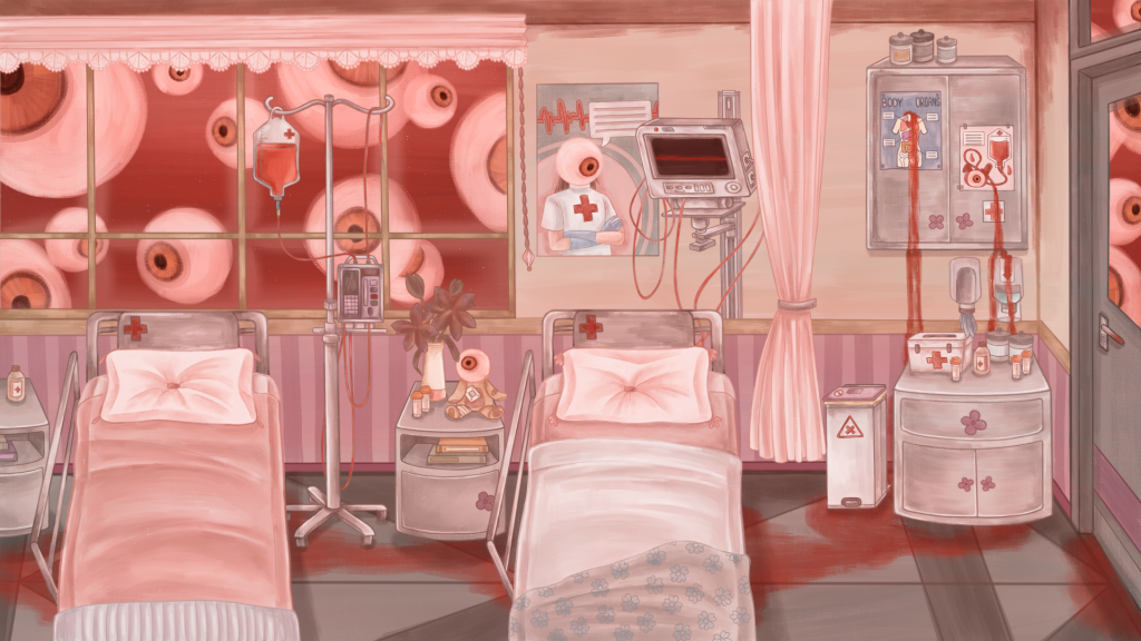
I changed multiple aspects of the original normal background (also with the salamanca brush): Such as the eyes looking in through the window and the door, the eyes scattered around on objects like the posters and teddy bear, the blood in the IV bag and trailed on the floor + leaking down from the posters, the wires being red now and the heart monitor flatlining. All of these features are there to show horror through Liliths weakened grip on reality – also through a medical theme.
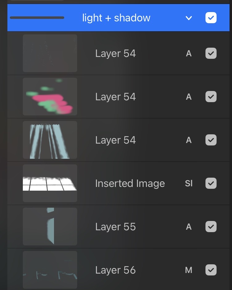
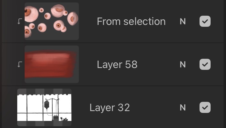
I also tested to see how the hallucination sprites would look in this environment, and I was satisfied with how they all came together to create a different, horror version of the original look. And below is an example of the change in layers used for this background.
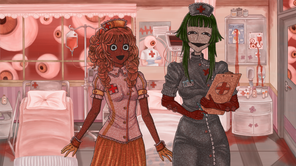
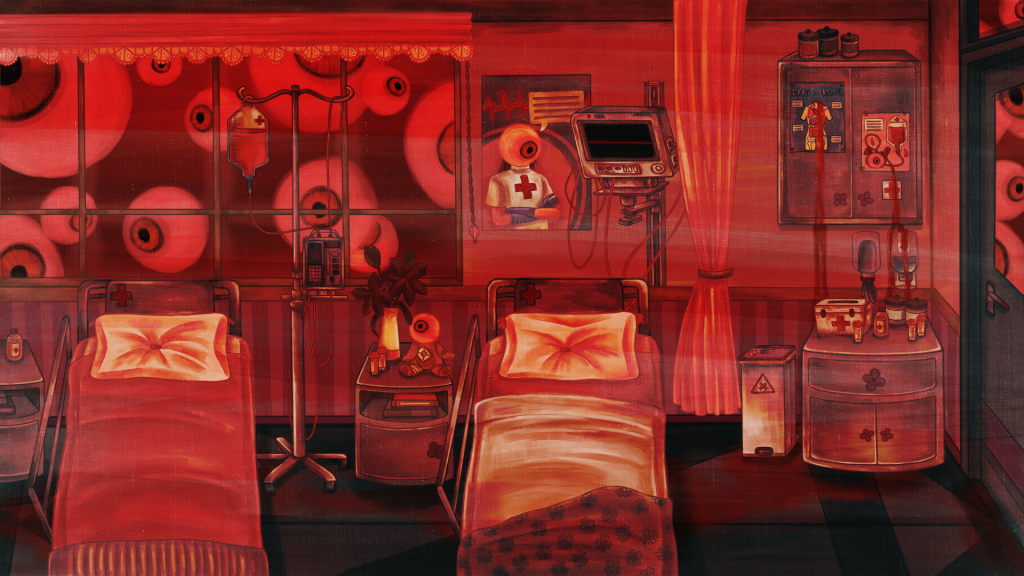
Lastly, I made a slightly different background version from the previous horror one. This one is meant to look quite a lot more hellish and unnerving – showing the final stage of Liliths paranoia and hallucination. I added a red overlay with a hard light blending mode and high contrast for this one.
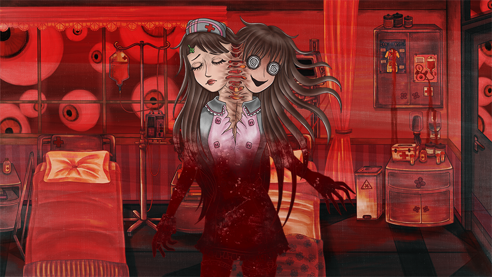
Here is another example of character and background together to provide the full horror feeling to the scene.