This section will explain my process for multiple UI/ GUI elements of the visual novel game, such as: The start menu, text box, menus and game icon.
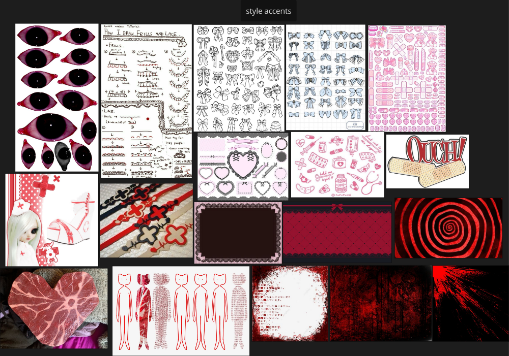
I created a moodboard of style inspirations of images mostly found on pinterest for the general overall feel of the UI elements. I wanted it to look spooky and cute at the same time, with lace/ bow accents but also elements of horror and medical items. I wanted to mostly use red and white together, as this is also cohesive with the medical theme.
Start menu:
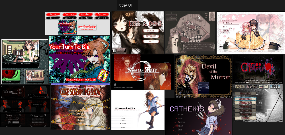
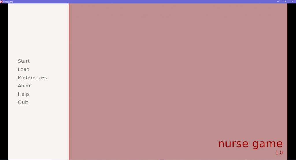
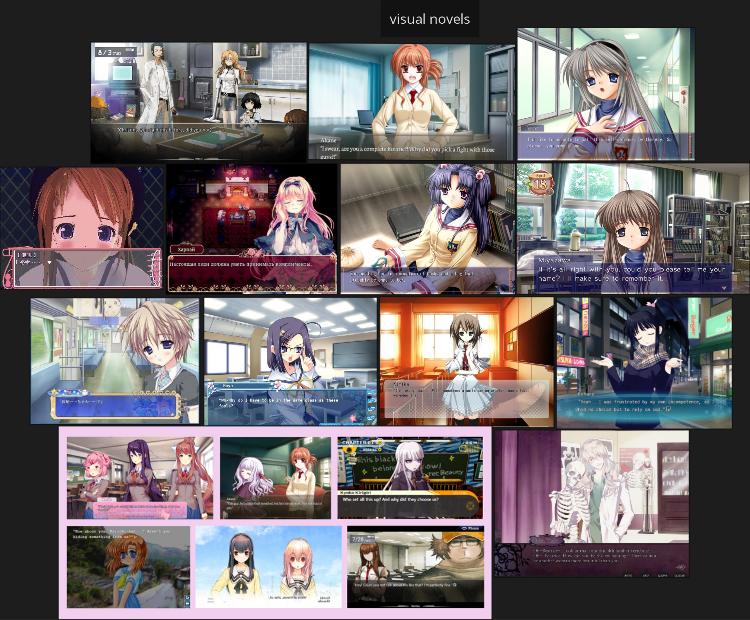
On my original asset list, I had planned for a ‘splash art’ main menu, however as I was beginning to run out of time procucing my assets, I changed this to be a little simpler. I also looked at multiple visual novel GUI start menu examples for reference and realised that a lot of these were simple – providing a feeling for the general vibe of the game mostly utilising graphic design with some illustrative elements. I collated some images of UI start menu examples, some from pinterest and some screenshots I took myself of games that I own.
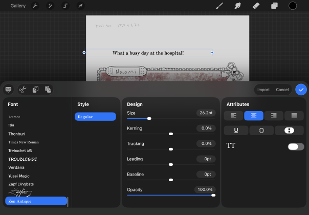
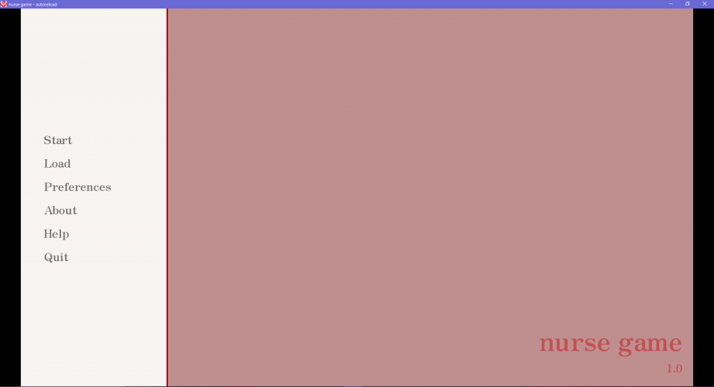
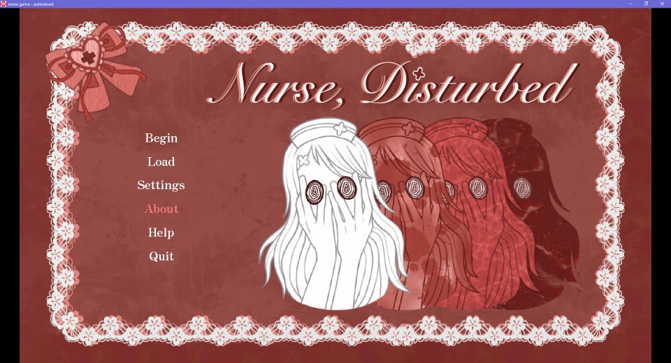
Below are the default start menus that are made upon creating a Renpy project, so changing the start menu involved swapping out the images in the GUI folder within my renpy game file and adding code in the GUI script (I will go more in depth on this in the Renpy development section). I had to make sure to make the meny 1920×1080 so that it would fit correctly in the place of the old menu. Firstly I had changed the font through coding, of the whole project to Zen Antique – a font that I liked in procreate (I had to find this online and download).
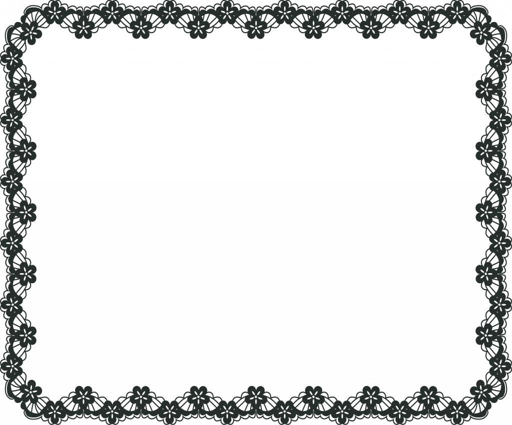
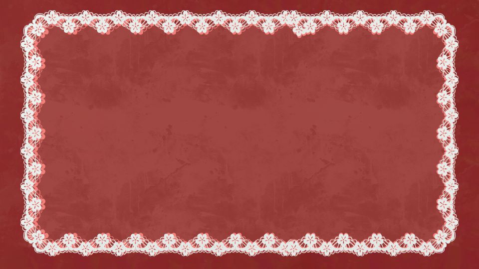
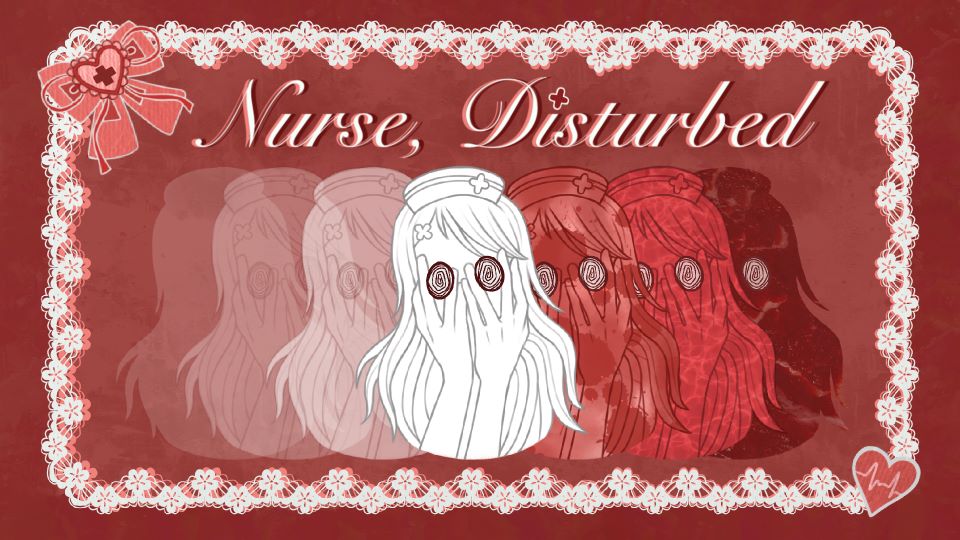
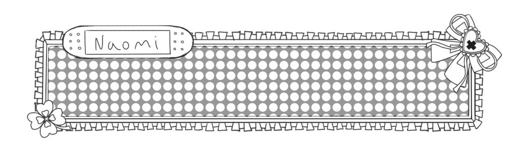
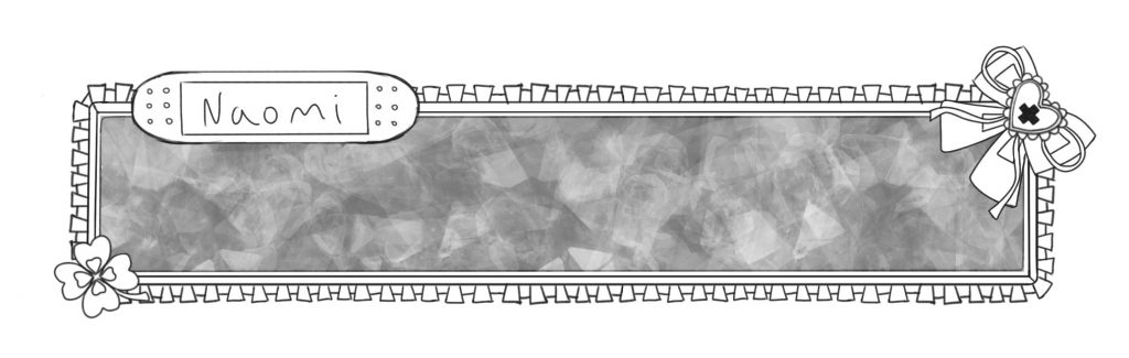
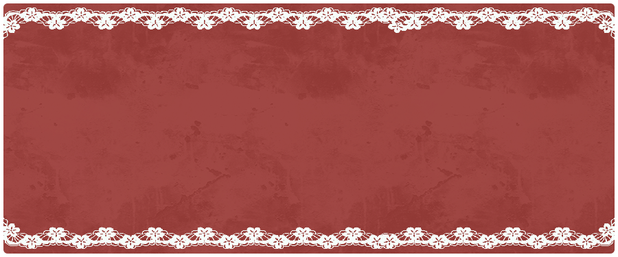
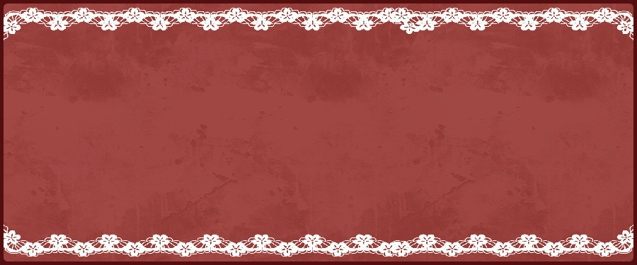
To design the new start menu I firstly created an image that I would use as a base for this and most of the other UI aspects. I used the grunge and water brushes in procreate to create a textured effect that looked like blood and painted a red canvas with this. Then I found some PNG images of lace frames online, changed the colours and stacked them – to create this base UI image.
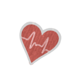
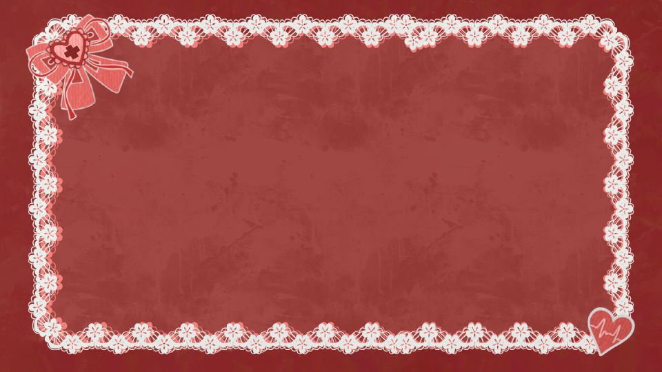
I also added on some style accents with a cute look but medical theme – this bow and heart with heart monitor lines, and added them to the base image.

I had decided the name of my visual novel by this point: ‘Nurse, Disturbed’ (I will talk about this more in the story section of this blog!) So I made this typographic of the title in procreate, using the theme colours and adding a red cross as the I dot for medical theme cohesion. I really liked this font but was a little worried that it would be hard to read – but I got feedback from multiple people who said it was fine.

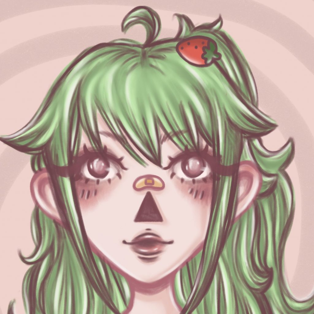
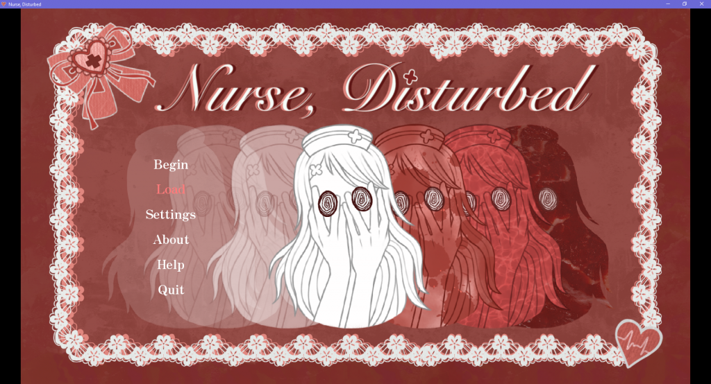
Next, for the actual illustration of the start menu, I decided I wanted to include the main character Lilith on it – inspired by some of my menu reference images that feature main characters. I wanted to express her fractured self to give some hint/ insight to the themes of the game. I also wanted to show some slight horror elements.

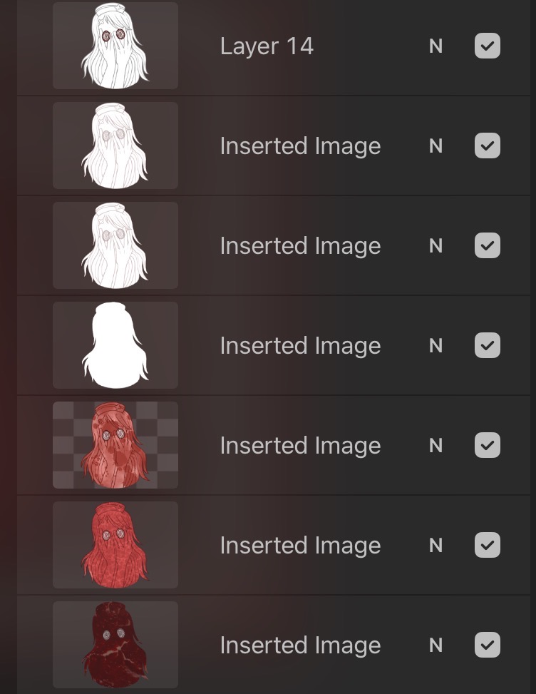
I drew this image of Lilith, wanting to keep it simple, just using line art and block colour, but drawing particular attention to the eyes, making them stand out against the lighter parts. And as eyes are significant visual feature of the other game assets I thought this was cohesive, creepy and interesting to look at. I based the rest of the illustration off of this.
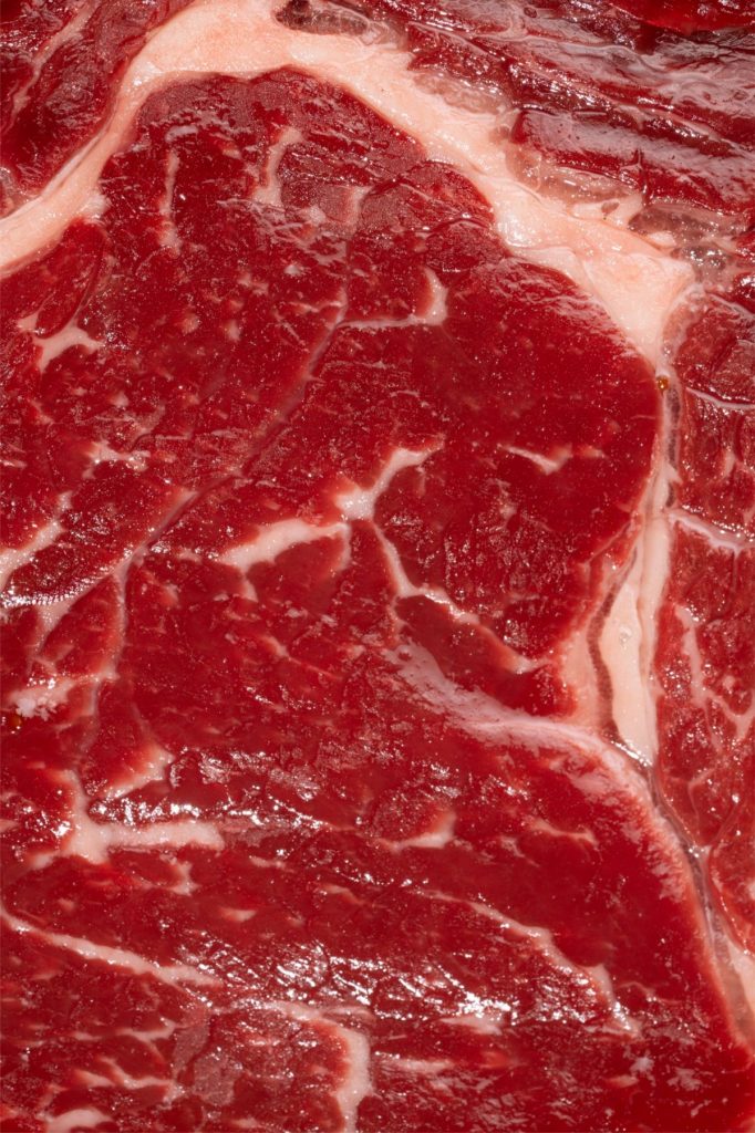
I used this image to create multiple other layers of Lilith, each showing her in a different version – showing her 2 sides/ personalities. On the right is the ‘evil’ side to her – shown through visual psychological cues, like the red, blood splatter, etc. I also used a close-up meat image that I got on pinterest for an overlay over the drawing here, as I thought it looked creepy and added some texture. And on the left, the images fade away, signifying her struggling to keep her sense of self. I made sure that the leftmost image was transparent enough to be able to read the options in white over it, that would show when placed into renpy.
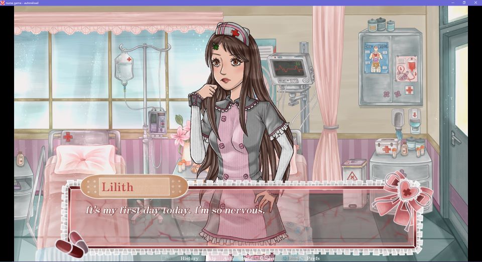
Below is the final version of the start menu, after it was imported into renpy and with the options buttons present. On the left is the first version of the menu that I made without the images on the left, but I realised this looked too plain.
Text box:
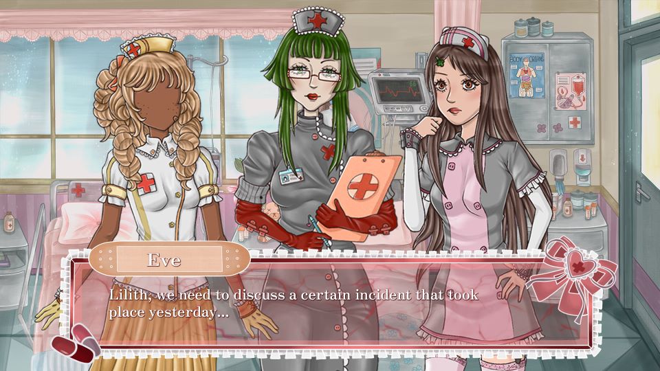
I created another moodboard specifically for the text box ui asset, using images from other visual novels to get a feel of what kind of style I wanted it to be. Most VNs use a very simple text box – as shown in a lot of the example images, however I knew that I wanted to design an asset a bit more intricate – that followed the stylistic themes of my game. I also used this moodboard as some reference for framing – like where the characters and text box should be placed in relation to eachother.
Below are is the default text box that is used when you create a new renpy file, and on the right is how it looked with my initial assets shown in E1. I took note of the size of this and made sure to have my asset match this so that it would correctly import into renpy.
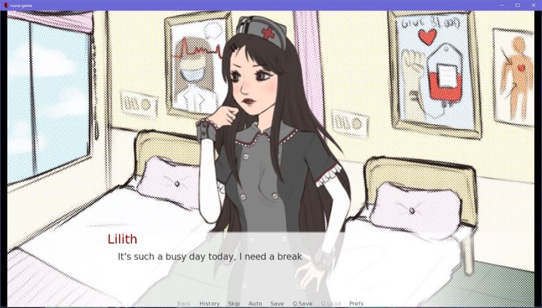
I started sketching out some ideas for my text box in procreate – using a grid to make sure the lines were straight and meaured the distance that it should be from the top and bottom of the 1920×1080 canvas. I also placed a character into the canvas to have reference of how it would look in game. I wanted to use a plaster as the name box and other medical motifs as it was cohesive and I though it was cute! I also used a similar bow as in the start menu.
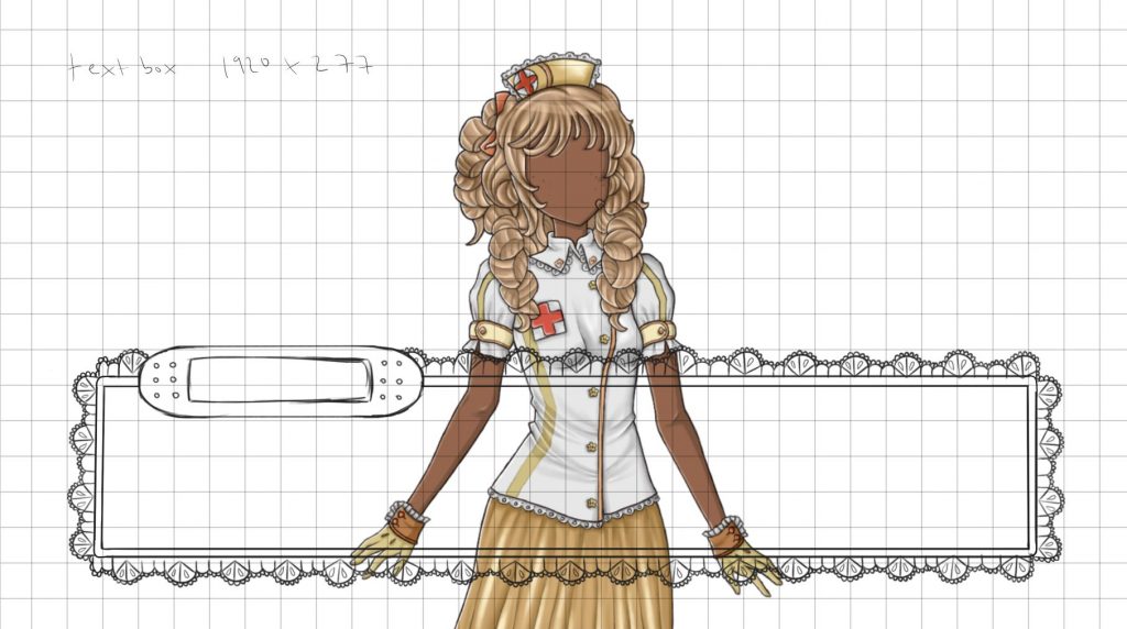
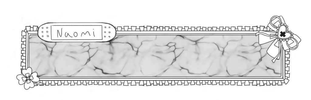
Then I experimented with different patterns and textures for the middle of the box – using different procreate brushes – this part would be quite transparent so that you can still see the characters/ backgrounds behind it, but also be able to read the text. I wanted it to be cute and match the vibe of the characters but also a bit creepy/ medical – hence the texture that looks a bit like blood.
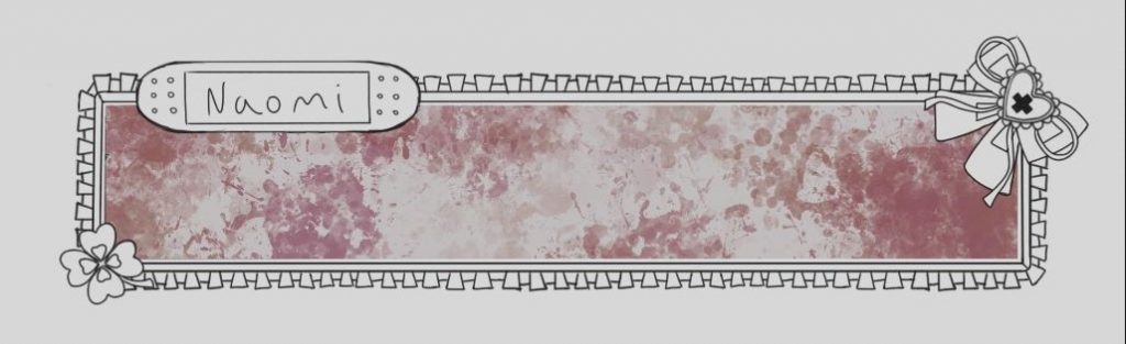
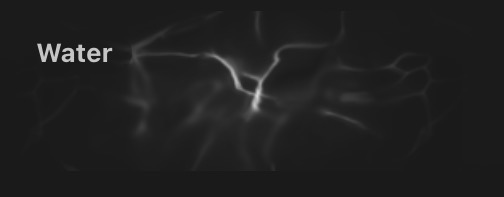
I decided to use this water brush in red, as I felt like it looked quite visceral a bit like guts or something like that – adding a creepy vibe to the otherwise frilly, lace look. I also decided to use white text against this texture as it looked best also against the character. (I also added a red outline to the text to make it easier to read).
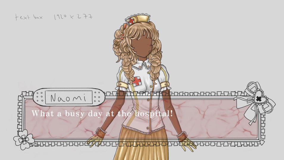
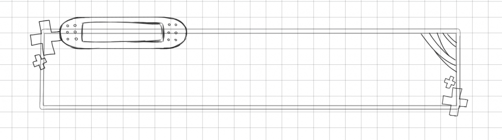
Once I finalised it and added colour I made a photoshop document to test how it would look with the other assets, and I ended up making it shorter so that the characters would be more visible. I also changed the clover in the left corner to a pills motif as this was more on theme.
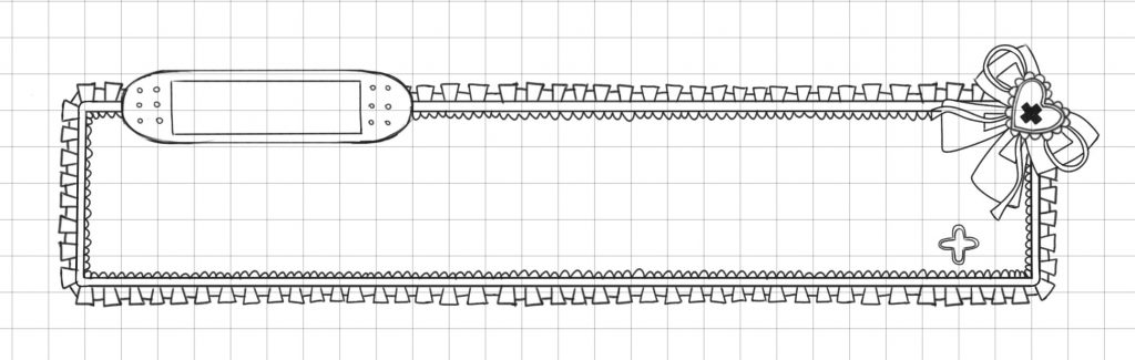
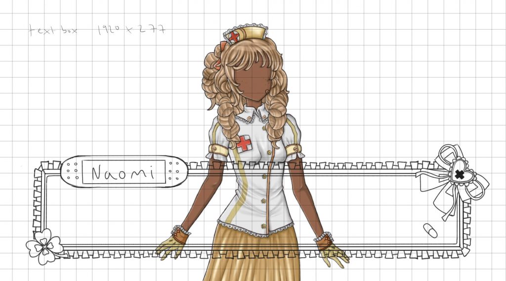
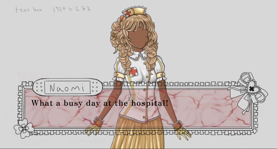
Below is the final text box, I improved the rendering a bit on the plaster, bow and pills and kept the same white, red and pink colour scheme in cohesion with the other UI elements. I will talk more about the actual in-game text in the renpy dev section!
Menus:
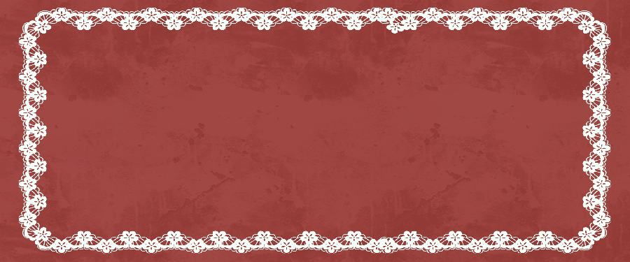
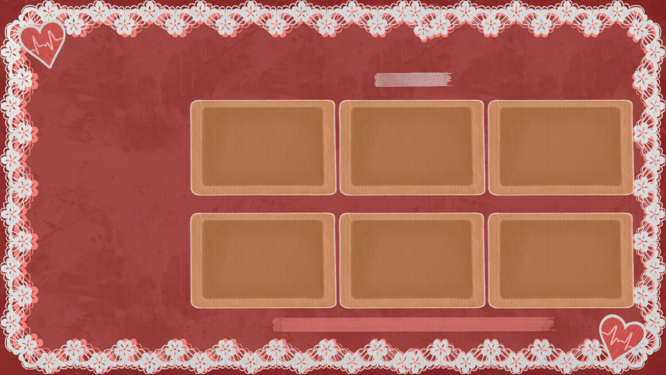
Here I will cover assets for 3 separate UI menus – for the saving/ quitting frame, the save menu and the settings menu. I worked from the same base image that I created, shown previously for the start menu, for all of these assets.
Firstly, the default frame in renpy was not optimal as with the text colour that I had chosen (text colour is changed through code and there are certain text types that can be changed), you couldn’t see the text as it was light on a light background. So I took the default frame into photoshop to maintain the size (900×375), and tested a few versions – using the base with lace images until I was happy with the result. I had to make sure it still looked good a little stretched out, as depending on the amount of text the frame had to be stretched to fit it all.
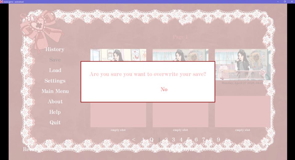
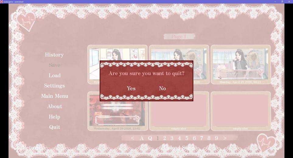
Below is the final frame with how it looks in game for quitting and saving.
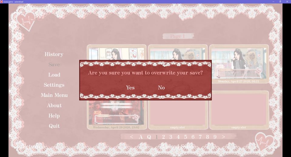
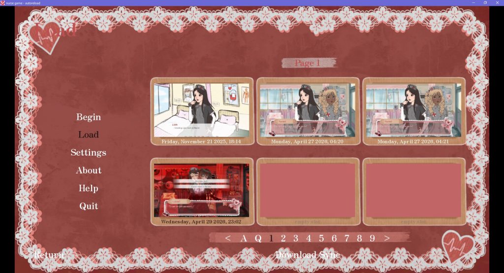
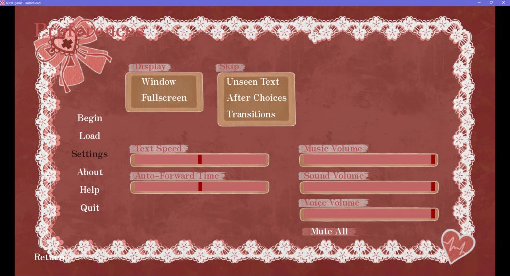
Next I made the menus for the saves and settings menus, which are both quite similar using the same motifs. Initially, I had imported the UI base image into the renpy file for the menus, however there was some clashing and the text could not be read. So to create these, I took a screenshot of how the menus looked and took that to procreate to draw over it and make sure everything was in the right place to be accurate in-game. Below is how the menus looked before.
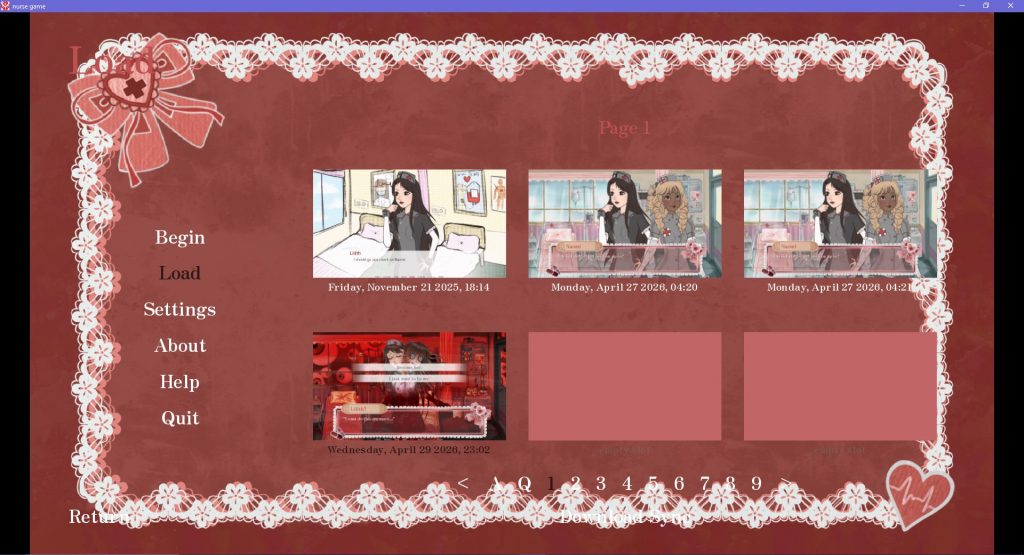

For these designs I drew some more plasters to act as the boxes for the save boxes, settings etc and used a textured brush in a light colour to act as a backdrop for the text so that it would be visible. For the saves menu I also made the lace frame bigger so that the text that was over it before would be readable. Below are the final menus and how they look in game.
Game icon:
I also changed the game icon in the renpy GUI file to the heart motif I showed previosuly that was used in my other UI assets. I had made it the drawing of Lilith from the start menu before this but you couldn’t really make out what it was so I went with the heart instead.

Seeing this icon and the game title in it’s own program was quite exciting for me as it was really looking like a real game!
As a side note, I realy enjoyed the UI creation as I had not really done much work like this before, but I liked the graphic design aspect and making everything look on theme with eachother.
I will talk more about the process of importing/ editing UI elements in the Renpy development section in the next post!